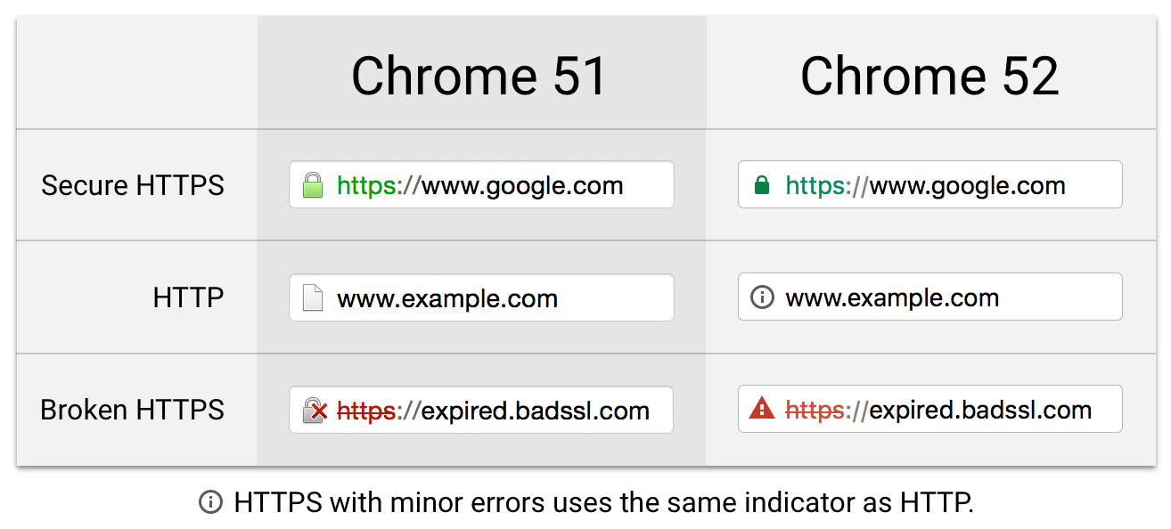
Google is making security icon changes in the Chrome status bar. The changes are based on a research paper prepared by members of Google and University of California, Berkeley. The research evaluated forty icons, seven complementary strings and surveyed 1,329 people.
The goal is to make it easier for browser users to determine how secure their connection to a site is and indicate if the site is dangerous or deceptive. In addition, the icons are to indicate to people that HTTP is less secure than HTTPS. Below are representations of the old icons and the selected new icons which are to be used in Chrome.

Updates have already been released on the Mac desktop with Chrome 52. Other platforms will be updated with Chrome 53 which is expected to be released on September 6, 2016.
The new icons are modeled after the ISO iconography standards, where the triangle is used for warning and the circle-i is used for information. Although the study did not indicate a color-shape combination that indicates a secure connection, Google is sticking with the lock icon and the color green to indicate secure HTTPS.
Future work will have the icons evaluated internationally by many new Internet users. Google also encourages developers to use the same icons to display security in a similar manner.
What about the extended validation (EV) SSL/TLS indication? The research paper states “Improving EV indicators are out of scope for our current work”; however, the EV indicator has been changed to keep the green lock icon consistent with the new changes.

These changes may be significant to your user base as Chrome represents between 50 and 70 per cent of the deployed browsers. Site administrators are encouraged to perform best practices to ensure their site security is represented by the green lock.


